Made with Love

Great vintage comic book ads

bobistheowl

BANNED
Joined
Oct 14, 2014
Messages
1,935
If the image is large enough to read the text, please provide the url, in addition to posting the image. If someone forgets, this information may be obtained by clicking Reply with quote, and copying the image url to the address bar of an open browser window. The poster can get a good idea of how big the full sized image is, by clicking the Preview Post button, before posting. Larger images will appear in that view of your unconfirmed post, before being reduced in size to accommodate forum image size limits.

Sea Monkeys:

sea-monkeys.jpg


Full size: https://4.bp.blogspot.com/-I7Ns0ynMOJM/UZKqkRIhPHI/AAAAAAAABXM/cfuP1IIBcDU/s1600/sea-monkeys.jpg

Sea Monkeys, (Artemia salina), are brine shrimp:

sea_monkeys.jpg


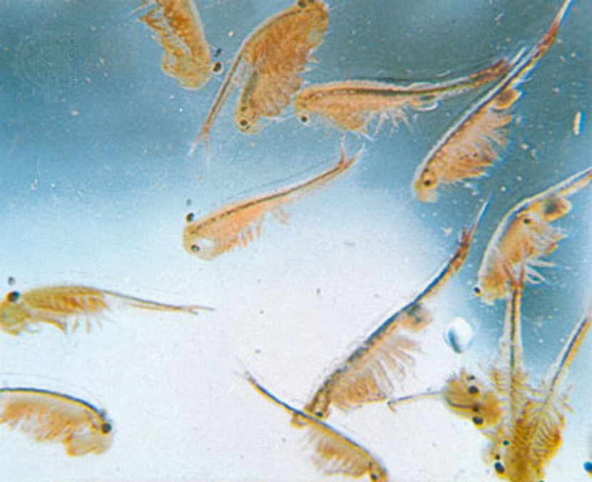
Note the legal disclosure to this effect, below the cartoon image, easily read at full size, by anyone who understands Latin genus/ species names.

They live in tidal pools that dry up completely at times, but they are revived, when water is reintroduced to their environment. Their commercial value is as food for 'farmed' fish, where they are added to the water in the fenced off pool by a guy with a shovel.

Some guy won a ton of them in a card game, (literally, a ton, 2,000 pounds), and decided to sell them to kids, a few grams at a time, through comic book ads.

In a few hundred years, they will again become popular on the Klingon home world and its' colonies, as the active ingredient in breakfast and energy drinks, because Klingons prefer their food and drink to be live, at the time of consumption.
 
YoungLove_n31_p40.jpg


Full size: https://2.bp.blogspot.com/_-U-XvMPS...AADII/0VeQUfnVmkU/s1600/YoungLove_n31_p40.jpg

I never saw this one before, because I wasn't a flat chested girl reading Romance comics in the 50's. I don't read any Romance comics from the '50's, unless they were drawn by Frank Frazetta:

ea80496c345fe3bbde6df79dae041c9f.jpg


larger: https://media-cache-ak0.pinimg.com/736x/ea/80/49/ea80496c345fe3bbde6df79dae041c9f.jpg

The 1987 Untamed Love one-shot from Fantagraphics, to my knowledge, reprints all of them, and could probably be had for a small premium above the original $3.00 Canadian cover price. Those original issues are worth hundreds of dollars, in Fine, or better, and possibly three figures for VG+.

The audio and video in this YouTube version are worse than a 60's educational film shown in schools, and a 70's 'B' porno, respectively, but Frank's genius for composition and rendering is apparent, to even the casual reader.

 
Transient said:
Everyone remembers this classic.

bGFUYo2.gif

There's a free .ttf font of those types of images, sans text, by Daniel Gauthier of Gaut Fonts, available here: https://www.moorstation.org/typoasis/designers/gaut/index.htm

called BackPage. All of Daniel's fonts are free, but he hasn't made a new one in years. There's a little text or image sample for each; select them by name from the list box at upper left.
 
Some great fonts on that page bob, thanks.

This was one of the ads that always scared me as a kid.

comicad6.jpg
 
Transient said:
Some great fonts on that page bob, thanks.

This was one of the ads that always scared me as a kid.

comicad6.jpg

Transient, Dan Gautier was one of the designers that got me interested in making my own fonts. He had a quote somewhere, possibly in a read me document, where he said something like 'this font is not for sale, but if you want to pay for it, make a font, and give back to the design community', or something to that effect, so that's why I started making them, because I had been collecting other people's fonts for a few years.

These images are from KleinKarpets:


I may use the one above as an 'owl' avatar some time.


each of the three images above is composed by typing two letters on line one, and two other letters on line two. I drew one image, then rotated it 90, 180, and 270 degrees, then flipped it horizontally, and did the same so I got eight different glyphs from each source drawing, and only needed ten sources for a complete upper and lower case. This font was split into two, to have all of the display in preview be in capitals, (ie: You only see capital J in preview), because the panagram sentence at various sizes uses too much memory in Windows Vista + ?, if ClearType is enabled. The images above were made with A,B,C,D,E,F and G.

Each of these images is 280 pixels square, the same size as my monochrome bitmap source graphics, made with MS Paint, so each individual source graphic is the same size as each of the 2x2 composites. I'm very 'old school', and this is the only graphics work I do, so I prefer to 'hand craft' them, rather than pay for software to make things to give away; I'm not that altruistic. It takes longer, but it isn't work.

This sequence, made with Q, R, S, T, U, V, W and X:


could be considered by some to be mildly erotic.

I did this in December 2007 - January, 2008, a few months after I made my first one. Someone mentioned it on a 'high brow' site, and the next comment was 'that font made me dizzy', and that was that.

I could improve this, but I probably won't. I might do another one like it sometime, with a different set of images, and I think I could eliminate the thin white line between lines of text.

This is not the sort of thing you try to sell. Who would buy it, and why? It's just something you do because you wanted to, instead of doing something else. It's to give other people inspiration, more than for anything else.

If you want a copy, you're probably best to use the 'split in two' version, (ie: two fonts, instead of one, Caps only), available here: https://www.dafont.com/kleinkarpets.font

I don't know of any other fonts that create composite glyphs. I have an experimental and unfinished font series called Schizophrenia, which involves the potential tiling together of multiple fonts into a document which, if printed, would connect seamlessly on the right and left edges, and on the top and bottom edges. It works, I just didn't make all the fonts necessary to make the biggest composite.

The source image is huge; 840 x 2520 pixels, but that's cut into 280 x 280 squares in a 3x9 matrix, so you make one picture from the whole font by typing ABC, DEF, GHI, JKL, MNO, PQR, STU, VWX, YZ1 on nine lines of text, three glyphs per line. You can then tile the next font horizontally to the right, by typing the same letter sequence; that one has the same glyphs, but with the black and white inverted. So, whole fonts tile together, like the glyphs in KleinKarpets.

That one I could draw, because it's all composed of lines of very specific slopes, that 'orbit' the source graphic until they return to the origin point. They intersect, and form three or four sided polygons. I chose to colour in any one polygon, then colour in all the others that don't directly border on it, so it looks like a checkecommunity, seen through a kaleidoscope, with one of the lenses broken. And no, I am not afflicted with this condition

If that interests you, ask me for a link. That one was never released officially, but it has circulated a bit on dark net forums. I became interested in other things before doing all of them, but I may go back and finish that one, some time in the future.
 
I am but a simple caveman. Your glyphs and panagrams frighten and confuse me...but cool none the less.

q3Uchhl.jpg
 
Full size:

The doll, with postage, cost more to produce than the $2.98 cost, but this was subsidized by the tobacco companies, who, even then, were looking for fresh and innovative ways to advertise cigarettes to kids.
 
1302207366wm_01_pg01_isfc.jpg


Full size: https://4.bp.blogspot.com/-VF2hDUHG...GQaHUl_Ss/s1600/1302207366wm_01_pg01_isfc.jpg

Shampoo had been invented by the '50's, but men didn't use it. They needed a whole bottle to get the Brylcreem out.

Brylcreem was just adulterated bacon fat, with the smell removed, and some preservatives added. The 'germs' referred to in the ad were the ones that survived the smell removal process, and they ate the preservatives, allowing them to better colonize a head, in a warm, moist environment. The same ownership group made both products.
 
1302019338wcb10p32ad.jpg


Full size: https://3.bp.blogspot.com/-N4CpmT9S...Sw/tw6ydo8qzKw/s1600/1302019338wcb10p32ad.jpg

To sharp eyed viewers who went Full size: That is, indeed, Sean Connery, in white. He wasn't a name yet, when he still had his own hair, so he needed to do cameo roles, like this one, to pay for his hobbying. Once Dr. No came out, he could get it free, anywhere, anytime, and especially with EEs, who swung both ways. He banged them, but he never trusted them.
 
1302020165Battle_Cry_no_4_195211_pg99a.jpg


Full size: https://1.bp.blogspot.com/-g5Nijezy...00/1302020165Battle_Cry_no_4_195211_pg99a.jpg

The ones that were returned for refund were washed out in warm water, then cold, then resold to some other kid.

Instead of having blackheads, you ended up with tons of little red 'blackhead hickies' where the needleless syringe had formed an airtight seal around the clogged pore.

This didn't work for pimples, and it never says anywhere that it does. Pus would clog the nozzle, but provide an environment in which the bacteria could survive, once removed from the host. If you let it dry, you needed to use a needle or a toothpick to unclog the hole.
 
oj-ad.jpg


Full size:
https://2.bp.blogspot.com/-ueIyFpQFCto/TiODJgzRKaI/AAAAAAAAAPc/gp2lk0k6R5c/s1600/oj-ad.jpg

OJ for Dingo Boots. He did TV ads for them, too. There was even a theme song, "That Dingo Man" sung in sort of a Nancy Sinatra song style. If there had been an apostrophe in front of the capital D in the title, the lyrics would have been different from the album version, when sung on TV. Not surprisingly, there is no YouTube link, but it might be somewhere on the dark net.

Somebody had a VCR in the late 70's, and they didn't pause the machine when the commercials came on. Years later, the show is on DVD, and if they look at the old tape, they would be looking for the parts they forgot to remove in the first place.

As far as the comic is concerned, I know it's inked by Vince Colletta, that's a gimme. Colletta was excellent at making the figures appear two dimensional, at all times. He did consistent hack work on time, and worked best with a bland penciller like Sal Buscema, with whom he collaborated on Captain America and The Falcon for an extended run.

The penciller is tough; it might have been a guy from an advertising background, who may or may not have drawn comics for 'the big two'.

I'm going to go with Neal Adams for breakdowns, and some junior at The Crusty Bunkers or Continuity Associates for finished pencils.

Adams originally worked in advertising, before Ben Casey. He's in the all time top ten of comic book artists, both in terms of the quality of his output, and the number of other artists who started out copying his style. He did hack work, in my opinion, most of the time after 1975, other than inking Gil Kane in a Conan in Savage Tales, pre Ka-zar. Ms Mystic for Pacific wasn't bad. He did a nice job on Super-Man vs Muhammad Ali, but not much else of note in four colour.

Keep in mind, however, that Adams was the main impetus for creator's rights in the comic book industry. He's the Curt Flood of comic books, along with Gene Colan, to a lesser extent. Kirby bitched a lot, but no longer had any juice; his later work was, in my opinion, both rushed, and ugly. He was doing, like, six books a month around '73-'75, and they looked like He Man cartoons, rather that comics. Royalties, ownership of created characters for other media, return of original artwork, that's all Neal and Gene, initially. They had help later, but at first, it was just them, and Jack acting like Morrie the wig salesman in Goodfellas.

If he did do the roughs, Adams would probably have been payed more for this Dingo boots ad than he would have received from DC for Batman #255, his last for them.

I bought a copy of Detective #400, (with Man-Bat and 'the new Batmobile', [June, 1970]), which looks like it could be a real car from a later era), at a garage sale years ago, and Adams' signature is on page 1.


Somebody will completely understand and appreciate this post, eventually.
 
Back
Top Bottom